
By Cynthia Challener, Contributing Writer
Life was anything but normal in 2020, and with widespread distribution of a COVID-19 vaccine unlikely to take place until later this year, many personal and professional challenges will remain in 2021. Based on 2020 sales data, Irish-based paint manufacturer Curator has identified three color trends resulting from the pandemic: growing interest in pink and purple as people seek to escape to alternative times and places, rising purchases of green hues driven by a desire to create a fresh and clean feeling, and greater use of neutral colors as a way to feel safe.
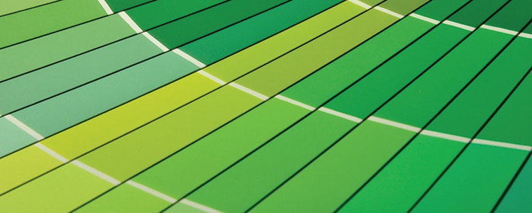
“In times of uncertainty like a pandemic, there is a yearning for home design to feel fresh and clean, providing us with a beautiful palette of greens similar to first responder uniforms,” notes Edel Nicholson, head of marketing at Curator.
Oregon-based Miller Paint forecasts a palette of calming connection, according to Puji Sherer, director of color marketing for the company. “2020 has been a challenging year full of uncertainty, and as a global community, we are seeking calm, comfort, and healing,” she says. “As a result, we are seeing two color-trend stories emerge: one of hope and one of connection.” Those trends, she predicts, translate well into increased interest in uplifting blue hues, since blue is inherently a trustworthy color, as well as a growing preference for warmer, earthy hues that offer grounding and stability, replacement of starker whites and greys with softer warmer whites as supporting colors, and more use of complex colors such as yellow-green and green-black as accents.
In times of uncertainty, there is a yearning for home design to feel fresh and clean, providing us with a beautiful palette of greens similar to first responder uniforms.
Overall, color trends are expected to reflect the need for comfort and serenity while also allowing for vibrant accents to make living spaces more cheerful and appropriate for both home and work activities. Earth tones and warmer pastels are expected to be complemented with cream/off-white and brighter shades reflecting a renewed connection to nature and the need to reinvent homes as inviting places for living full lives during the pandemic.
People are looking for stability amid uncertainty, according to Andrea Magno, Benjamin Moore director of color marketing and development. “The colors we surround ourselves with can have a powerful impact on our emotions and wellbeing,” she says. When consumers set out to transform their living spaces, they find assurance in the color expertise and guidance of paint manufacturers, adds Heleen van Gent, creative director of AkzoNobel’s Global Aesthetic Center. “That’s why our global color research is at the top of our agenda every year,” she says.
Benjamin Moore’s Color of the Year 2021 is Aegean Teal 2136-40, a blue-green that creates natural harmony while inviting reflection and resetting by being comforting and uplifting, Magno says.
Several other companies, however, selected colors seen as “grounding.” For its color of the year 2021, AkzoNobel chose Brave GroundTM, a warm neutral shade that gives people the courage to embrace change. “According to our extensive global trend research, what people need most right now is to feel the ground beneath their feet. When we can take comfort in the stability of simple things, we’re emboldened to express ourselves, stand up for what we believe and make new connections from the past to the future,” van Gent says. This neutral color works well on its own, but it becomes even more empowering when used easily in combination with four complementary palettes: Expressive, Trust, Timeless, and Earth.
Similarly, Dulux’s color experts chose Brave Ground, a warm, earthy tone and bolstering shade connected to nature that generates a feeling of stability, growth, and potential by providing a firm foundation for change and creativity, according to the company.
Continuing its 2020 theme—using color to feel grounded—Sherwin-Williams selected as its color of the year for 2021 Urbane Bronze SW 7048, “a warm, sophisticated bronze, the color inspires all of us to find sanctuary in any space,” according to Sue Wadden, director of color marketing at Sherwin-Williams. “The home is now the ultimate retreat from the world, and color is an easy and effective way to create a personal haven. Urbane Bronze is a rich anchor that grounds the mind in calm and stability with its ties to the natural world,” she comments.
The 12 hues in Benjamin Moore’s Color Trends 2021 palette reflect this grounded sensibility, say Magno, pointing to the warm, sunbaked hues that play to the senses and express a welcoming, lived-in quality that celebrates the connections and moments that take place within the home.
PPG identified three key trends: Be Well, Be True, and Be Wild. According to Amy Donato, PPG’s senior color marketing manager, the trends seek to celebrate the beauty that comes from prioritizing wellness, authenticity and connection, embracing joy and a desire to move past fear, and aiming for a more balanced world by connecting with others with compassion and kindness. The 2021 paint color palette from PPG (Transcend, Big Cypress, and Misty Aqua) includes natural and serene paint colors that are intended to be comforting, compassionate, and nostalgic, and reflect on wellbeing, sustainability, and human connection. “Our global color stylists were drawn to these colors as they evoke feelings of compassion and comfort, which resonates and represents the shifting mood of society,” says Donato.
The BEHR Color Trends 2021 Palette includes 21 shades organized into four themes: Mindful Escape, Curated Clarity, Optimistic Glam, and Dramatic Revival. According to Erika Woelfel, vice president of color, the colors are meant to be used with one another to set the mood of various residential and commercial settings. “Knowing that designers have their own unique approaches and that everyone is working to adapt to our changing society more than ever, our 2021 Color Trends Palette is intentionally compatible with just about any color, style, or décor,” Woelfel says. “This collection for 2021 represents a new, elevated articulation of comfort that goes beyond traditional beige, gray, and green hues, and embraces color in a way that can redefine and enhance any type of space.”
Sherwin-Williams also picked four color palettes for its 2021 Colormix® Forecast that address “the balance between fast and slow, quiet and expressive, and virtual and physical,” the company says. Sanctuary reflects the return to nature; Encounter is a modern bohemian aesthetic with natural materials and rich earthy tones; Continuum reflects how technology and smart living blend; and Tapestry conveys the need for creativity and expression.
References
- Jennifer Kelly Geddes, “Update: See What COVID-19 Has Done to 2021’s Colors of the Year,” Oct. 16, 2020. https://www.realtor.com/news/trends/see-what-covid-19-has-done-to-2021s-colors-of-the-year/
- The Nordroom Blog, “The Color Trends For 2021: Warm Comforting Hues
And Bright Color Pops,” Sept. 8, 2020. https://www.thenordroom.com/blog/2020/9/8/the-color-trends-for-2021-warm-comforting-hues-bright-color-pops - Lauren Wicks, “Top Interior Designers Predict the Biggest Color Trends for 2021,” Sept. 25, 2020. https://www.veranda.com/home-decorators/advice-from-designers/g34148741/color-trends-2021/
CoatingsTech | Vol. 18, No. 1 | January 2021