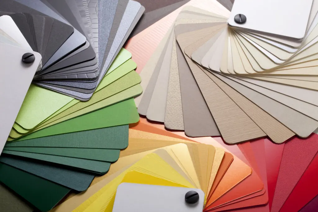
From the early days of childhood when we first discovered the rainbow’s full spectrum—or heard Kermit sigh that “it’s not easy being green”—color has been embedded in our memories. That is because color affects us emotionally and visually. Who didn’t feel a rush of excitement when cracking open that first box of 64 Crayola crayons, each shade promising a new adventure on the page?
As adults, those same hues and tones continue to shape how we feel and how we decorate our spaces. Paint manufacturers recognize this, leading to one of the industry’s most anticipated annual events: the announcement of the Color of the Year, when paint companies try to capture the mood of the moment and inspire the design decisions of tomorrow.
For 2026, paint and coatings manufacturers have shifted towards earth inspired and emotionally comforting colors that evoke feelings of calm and a sense of rootedness. We have put together a roundup of some of the more popular palettes.
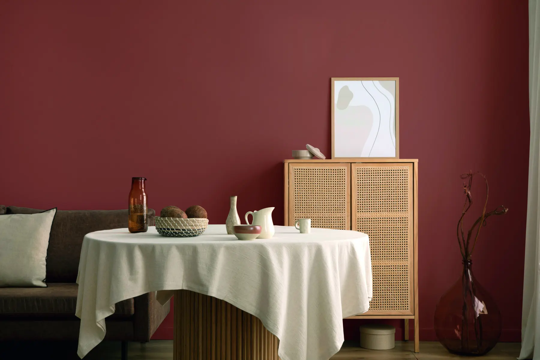
Sherwin-Williams: Universal Khaki
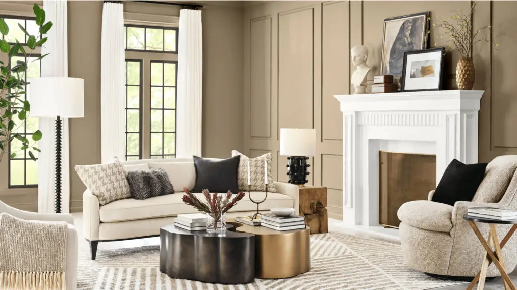
Sherwin-Williams and its sister brand, HGTV Home by Sherwin-Williams, have introduced a joint 2026 Color of the Year—Universal Khaki SW 6150. This warm, grounded neutral, selected by the Global Trendsight Team, signals a return to the essentials—offering a calming simplicity and enduring appeal.
“Khaki is more than just a neutral—it’s a timeless, go-anywhere shade that brings a sense of grounded elegance to any space,” shares Sue Wadden, director of color marketing at Sherwin-Williams. “With its warm, earthy undertones, Universal Khaki SW 6150 effortlessly complements a wide range of colors, creating a rich, inviting backdrop that can transform an entire design with quiet confidence.”
Universal Khaki serves as the anchor for the HGTV Home by Sherwin-Williams 2026 “Honest Essentials” Collection of the Year, which features 10 hues that draw inspiration from nature and offer earthy yet bold color combinations. The collection ranges from a neutral brown, off-white and stucco shades, burgundy wine and reddish terracotta, rich bold blues and greens, to a soft buttery yellow.
Valspar: Warm Eucalyptus
For its 2026 Color of the Year, Valspar has chosen Warm Eucalyptus 8004-28F, a green hue with warm undertones. According to Valspar, this shade reflects a collective desire for calm, drawing its inspiration from nature.
“Warm Eucalyptus is more than just a beautiful shade of green; it’s a reflection of the comfort we crave in our homes,” says Sue Kim, director of color marketing at Valspar. She notes that its warm undertones create a grounded, welcoming mood.
Valspar has chosen two complementary colors to pair with it: Groundbreaking 8005-8F, a deep brown with gray undertones, and Degas Blue 8004-35B, a light blue with hints of green and gray.
Dutch Boy Paints: Melodious Ivory
 Dutch Boy’s 2026 Color of the Year reflects a cultural shift towards simplicity, authenticity, and intentional living. Melodious Ivory (3132DB), a soft, versatile neutral, complements a wide range of interior styles—from modern to traditional to rustic.
“Our 2026 Color of the Year invites homeowners to embrace what matters most—comfort, quality, and connection,” says Lisbeth Parada, color marketing manager, Dutch Boy Paints. “Melodious Ivory offers a classic backdrop that beautifully supports the textures, elements, and personal touches that make a space truly feel like home.”
Dutch Boy’s selection is the result of a trend-forecasting process that draws on design research, market insights, and cultural analysis. In addition to its Color of the Year, the company unveiled its full 2026 Color Trend Forecast, including three color palettes that showcase Melodious Ivory’s versatility.
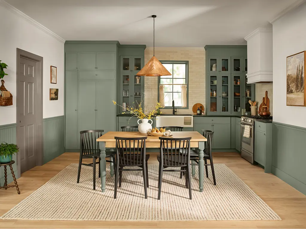
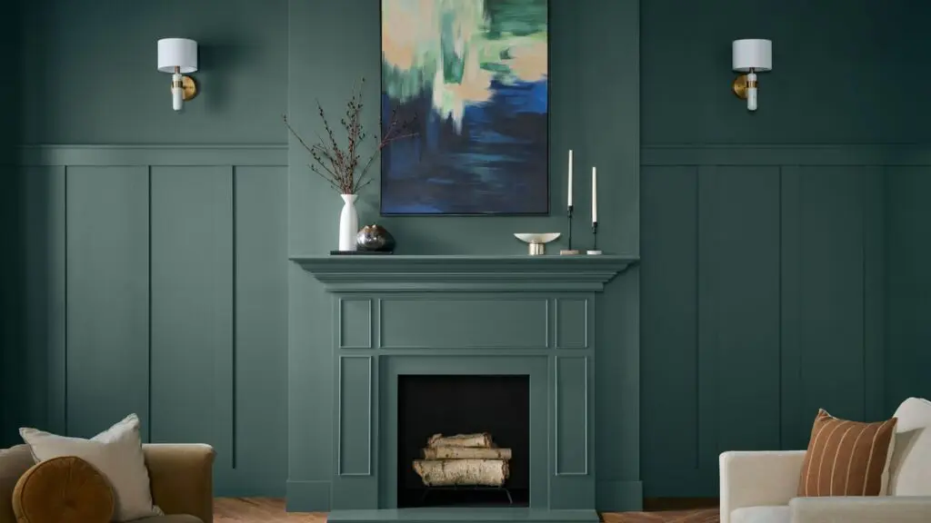
Dunn-Edwards: Midnight Garden
![]()
Dunn-Edwards has announced that its 2026 Color of the Year is Midnight Garden (DE5657). Reminiscent of moss, lichen, and nature’s quiet resilience, this deep, muted green with earthy undertones is intended to capture the quiet elegance of nature. According to the team of Dunn-Edwards color experts, designers and consumers are gravitating towards tones that balance modern sophistication with a growing desire for grounding.
“Midnight Garden is the green that works everywhere—from cabinetry and walls to accents and exteriors,” says Lauren Hoferkamp, color marketing manager at Dunn-Edwards. “Its versatility makes it equally at home on interiors and exteriors, pairing effortlessly with natural textures, warm neutrals, or sleek minimalism.”
Midnight Garden is intended to complement Dunn-Edwards 2026 Color Trends’ palette of warm terracottas, balanced purples, and notable neutrals. It demonstrates the versatility of green as a bridge color—able to harmonize with both bold and subtle design directions.
Behr Paint Company: Hidden Gem
While some paint manufacturers are leaning into more neutral tones, Behr Paint Company has chosen a smoky jade, Hidden Gem (N430-6A), as its 2026 Color of the Year. According to Behr, this dynamic blend of blue and green creates environments that feel both grounded and energizing—striking a redefined balance as a one-of-a-kind color.
“Now more than ever, there’s a growing appetite for colors that challenge convention and bring an unexpected sense of wonder to everyday spaces,” says Erika Woelfel, VP of Color and Creative Services at Behr Paint. “Hidden Gem captures that spirit in both name and color—its depth and refinement meet the desire for colors that are eternally stunning and stylish.”
Behr has also unveiled its 2026 Color Trends Palette—a collection of trend-forward colors that consist of earth tones, deep jewel tones, and relaxed pastels that are intended to complement the 2026 Color of the Year.
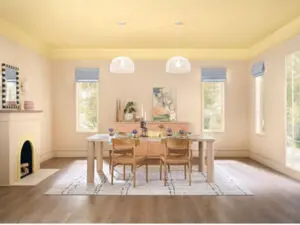
PPG: Secret Safari
 The balance between energy and vitality and soothing comfort is the inspiration for PPG’s 2026 Color of the Year. Secret Safari (PPG1110-4) is a yellow-green shade, designed to reflect a botanical aesthetic.
“Secret Safari is a versatile shade that adapts to its surroundings,” notes Irina Hanhisalo, PPG color category lead, Architectural Coatings. “It evokes a sense of calm in natural daylight and reveals layered depth in shadowed or low-light settings, making it a versatile choice for both residential interiors and commercial spaces.”
The shade is part of PPG’s 2026 global color theme, Parallels, which includes three distinct palettes: Authentic (earthy tones and natural textures), Visionary (balanced contrasts and bold accents), and Expressive (vibrant hues and dynamic combinations). Secret Safari complements all three palettes, offering customers a flexible foundation for color layering.
Benjamin Moore: Silhouette
 In selecting its 2026 Color of the Year, Benjamin Moore drew inspiration from the world of fashion for a modern take on classical suiting. The result is Silhouette AF-655—a mix of rich espresso hues with subtle notes of charcoal. According to Benjamin Moore, the color reflects a balance of refinement and distinction, weaving a narrative of enduring style and grace.
“The connection between fashion and interiors has always been a source of inspiration but this year in particular, we’ve noticed a renewed interest in suiting and classic silhouettes; the resurgence of timeless pieces; and the growing interest in the brown color family,” says Andrea Magno, director, color marketing & design at Benjamin Moore. “Silhouette embodies these qualities with its depth and luxurious blend of burnt umber and delicate charcoal undertones. Like a perfectly tailored suit, this hue has the versatility and softness to bring a space from expected to exceptional.”
Silhouette AF-655 is complemented by seven hues of the Benjamin Moore Color Trends 2026 palette. With its focus on attention to detail, craftsmanship, and refinement, the Color Trends 2026 palette balances pales and midtones.
California Paints: Cactus Valley
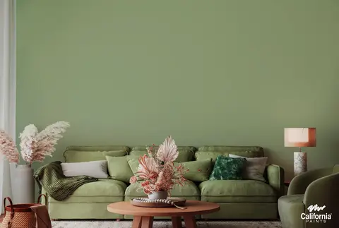 California Paint has announced that its 2026 Color of the Year is Cactus Valley. Inspired by desert landscapes and garden greenery, this shade reflects the grounded, nature-centric direction of design trends for 2026. According to California Paints, Cactus Valley’s rich, organic tone signals the growing desire to create environments that feel balanced and timeless, with a deep connection to the outdoors.
“Consumers have consistently and increasingly expressed a desire to bring the spirit of the outdoors into their interiors, and California Paints’ Cactus Valley is an ideal way to realize earth-centric aesthetics within any home,” comments Dani Doerge, marketing manager, California Paints.
Cactus Valley is designed to be complemented by a carefully curated palette of hues. Rich teals and deep mauves lend depth and sophistication, while soft creams and muted yellows infuse warmth and gentle brightness, and powdery blues offer a serene, calming presence.
Clark+Kensington: Hazelnut Crunch
 Ace Hardware, the world’s largest hardware cooperative, has announced the launch of Hazelnut Crunch (09A-5) as Clark+Kensington’s 2026 Color of the Year. The color, a rich, earthy neutral, is intended to strike a balance between familiarity and boldness to bring depth, warmth, and versatility to any space.
“In an increasingly fast-paced world, homeowners desire spaces that offer restoration, comfort, and calm,” shares Kim Lefko, chief marketing officer at Ace Hardware. “Hazelnut Crunch delivers all of that and more. It’s a beautiful, deep shade that creates the perfect backdrop for relaxed living, pairing effortlessly with both natural textures and modern elements.”
Selected by color trend forecasting partner, Colour Hive, and the Clark+Kensington design team, Hazelnut Crunch was inspired by consumer trends toward biophilic design, cozy minimalism, and nature-rooted tones. As the centerpiece of the 2026 Clark+Kensington Color Trends collection, Hazelnut Crunch anchors two curated palettes—Grounded, featuring warm, neutral shades; and Tranquil, made up of softly shaded mineral hues.
Krylon: Matte Coffee Bean
 Krylon’s 2026 Color of the Year is Matte Coffee Bean, a rich brown that reflects the growing preference for spaces that feel both calm and connected to nature. The color was selected by Lisbeth Parada, Krylon color marketing manager, who notes that Matte Coffee Bean taps into the rise of dark neutrals that offer a rich, restorative, and versatile foundation for the home.
“Matte Coffee Bean adds dimension with a natural, grounded allure, aligning with today’s increasing appeal of organic minimalism,” says Parada. “Inspired by elements like clay, wood and stone, this hue is a timeless yet sophisticated choice that elevates everyday spaces and invites a sense of harmony and serenity into the home.”
Matte Coffee Bean is complemented by a color palette that combines neutrals with warm accents, including Satin Khaki, Hammered Black, and Metallic Gold.
Glidden: Warm Mahogany
 Glidden has announced under Pittsburgh Paint Company that its 2026 Color of the Year is Warm Mahogany (PPG1060-7), a rich, warm-toned red that is designed to be both functional and fashionable. The shade is recommended for interior walls and trim, in particular in bedrooms, kitchens, dining rooms, and home libraries, where its depth creates a sense of intimacy without feeling too dark or heavy.
“We’re torn between colors that feel authentic, personal, and safe, and those that give a rush of newness, risk, and excitement,” says Ashley McCollum, Glidden paint color expert. “Converging style and history, Warm Mahogany is a perfect match with the Glidden brand’s 150-year heritage—bold enough to draw immediate attention and reserved enough to make a timeless statement. This color truly outlasts the moment and owns the mood!”
C2 Paint: Epernay
 C2 Paint has chosen Epernay #639 as its 2026 Color of the Year. This sophisticated soft ochre is intended to convey warmth and comfort. The color was inspired by the French village, Epernay, unofficially called the “Capital of Champagne,” and well-known for its vineyards and rolling hills.
“This historic hue helps us retell the wondrous stories woven through history via the inseparable threads of color, art, furnishings, and nature. It reminds us to appreciate the personal touches that make a home uniquely ours—and to live with reverence for the stories we’re creating every day,” comments Philippa Radon, interior designer and C2 color specialist.
Epernay is a shade featured in C2Paint’s 2026 palette, En Terre, which celebrates nature and reflects a deeper movement toward heritage, craftsmanship, and mindful design.
Vibrantz: Infinity Blue
 Virbrantz team’s color science and commercial experts have chosen “Infinity Blue,” a deep and calming blue that evokes stillness, clarity and a sense of grounded reflection.
“Infinity Blue reflects the clarity, calm and intentional design direction we see shaping markets worldwide,” said Barry Misquitta, president of Color Solutions at Vibrantz Technologies. “Our teams are deeply engaged in understanding global color behavior, material trends and the needs of our customers. Selecting this hue underscores our commitment to delivering innovative, high-performing and more sustainable solutions.”