As the new year approaches, many in the coatings industry anticipate the reveal of colors, palettes, and hues that will serve as a top choice for consumers and designers in the coming year. Strategists, color experts, designers, and curators assemble to analyze trends from a variety of inspirational sources to determine which color will be chosen as Color of the Year. In 2017, color choices range from neutral to bold, from simplistic to dramatic.
Benjamin Moore
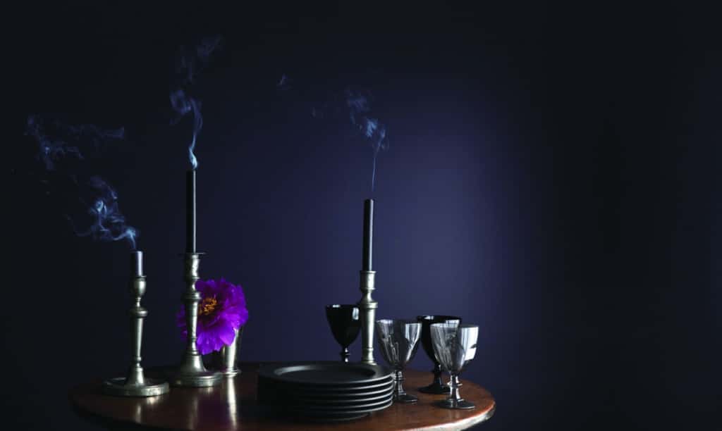
As its 2017 color of the year, Benjamin More chose the royal amethyst color, Shadow 2117-30. Benjamin Moore’s color team visited art fairs and exhibits, closely monitored international and domestic cultural influences, and was inspired by dramatic sculptures and contemporary art in search of their 2017 signature color. “Shadow is sophisticated, provocative and poetic, said Ellen O’Neill, creative director for Benjamin Moore. “It can bring energy to a space or harmony and a moment of respite.”
Additionally, Benjamin Moore’s Color Trends 2017 palette features 23 rich and sophisticated hues ranging from muted pales to saturated deeps that complement Shadow 2117-30. In curating the palette, the Color Studio extensively considered the pairing of colors and relationships between color families, as well as a new focus on deeper hues among design professionals and consumers. The Color Trends 2017 color card shows the use of color in ways that celebrate how shadow and light travel throughout a space during the course of a day.
Sherwin-Williams
In a shift towards something more neutral, Sherwin-Williams has chosen Poised Taupe SW 6039 as its defining color for 2017. The company stated that this color creates a cozy lifestyle and brings a sense of sanctuary into homes. A marriage of grays and browns, Poised Taupe SW 6039 creates a pigment that is equally weathered and neutral. “Consumers yearn for spaces that feel welcoming and hug them as they enter,” said Sue Wadden, director of color marketing for Sherwin-Williams. “Earthen brown combined with conservative gray, creating Poised Taupe, embodies all of these emotions.”
In 2017, warmer colors are predicted to reach commercial spaces in addition to colors chosen for homes. Influences that include natural or organic materials, weathered and worn finishes, and global cultural preferences have suggested alternatives to the primarily gray existence that has been the focus of commercial color direction over the past five years. “Since commercial color direction tends to enjoy longer lifecycles, Poised Taupe is on the forefront of this trend, offering the ability to endure over time, yet complement a wide range of designs,” said Wadden.
Valspar
Valspar did not choose just one color as its choice for the year; it chose twelve. “Choosing a color for a project can be challenging when options are endless,” said Sue Kim, Valspar color strategist. “So, we’ve curated a collection of twelve livable hues to give consumers choice and confidence in discovering and expressing their own style.” The 2017 Valspar Colors of the Year were inspired by influences from culture, fashion, design, nature, and technology. The colors are also reflective of what seems to be the dominant trend–sustainable and simplistic living, spirituality, and self-improvement.
Limitless color options are available for consumers as home improvement projects and cosmetic updates get underway in 2017.